Sunday, August 27, 2017

Wine a Little CAS Card with Rubbernecker Stamps

Rubbernecker Stamps, CAS Card, Wine a Little, Watercolor Stamping

This card is a Clean and Simple (CAS) design featuring Rubbernecker Stamps - "Watercolor Wine Bottle." They are known for their awesome watercolor stamps. This is a two part stamp - very easy to use, although I recommend using a stamp platform or positioner to get the alignment perfect. I paired it with a fun sentiment.

Affiliate links may be included in this post. I participate in the Amazon Services LLC Associates Program, an affiliate advertising program that provides a means for me to earn fees by linking to Amazon.com and affiliated sites at no cost to you. This helps offset a small portion of my crafting addiction... uh, hobby. See notice at bottom of blog for a longer description.

Making the Card

1. I used Color Burst pigment powders in Lamp Black and Merlot to color my image. Carefully add a little of each color to a palette (or different areas of a craft mat). Add a little water with a watercolor brush - but not too much; you want it to stick to the stamps. Mount the outline of the bottle and glass to a stamp platform (or positioner), brush with Lamp Black, and stamp on watercolor paper. Important: pay attention to the glass bottom and stem - leave enough room around the image for die cutting. Clean stamp with water and remove.

2. Use a slightly wet brush on the image to move some of the black around in a few places. This will give it more of a "watercolor look."

Tim Holtz Tonic Studios Stamp Platform

3. Use the stamp press or positioner to position then stamp the splashing wine, using Merlot Color Burst. I recycled a sheet of clear plastic packaging to use in my stamp platform for positioning. I stamp on the plastic first (using regular ink) with the plastic butted up against one corner, leaving room around the stamp area for positioning. See above photo. Next I line up the paper under it, remove the plastic (I use magnets to hold the paper), and stamp. Use a slightly wet brush to fill in any gaps (e.g. if the paper is textured). You may want to add more color from the palette. Once dry, die cut with second largest stitched rectangle.

4. Cut white cardstock 4 1/4 x 11 inches; fold in half to form a 4 1/4 x 5 1/2 inch top folding card base.

Rubbernecker Stamps, Watercolor Stamping

5. Die cut burgundy cardstock with largest stitched rectangle. Adhere to card base. Adhere stamped image to this.

6. Using VersaMark Ink or other embossing ink, stamp Wine a Little on vellum. Emboss in black. Trim down, leaving extra space on the right for tails. Mark a light dot in the middle of the right side, as far in as you want the tails cut. Cut from the corners to this dot to form tails. Adhere to card where shown by using small dots of glue (I use Multi Medium Matte) behind the letters; put a weight on it until dry (couple minutes).

7. To make the stars, use Sizzix Triplits Stars dies by Stephanie Barnard. I didn't have any black or wine colored glitter paper so I made my own using black cardstock, glitter, and double-sided adhesive. Add double-sided adhesive to both sides of a piece of cardstock (large enough for some stars). Die cut stars (I used the smallest die for two and the next size up for one). Remove backing from one side of each, dip them in glitter, and burnish with your finger. I used Bright Cranberry on one of the smallest stars and Basic Black on the other two. Optional: the Bright Cranberry didn't match perfectly so I used a B99 Copic Marker to gently color over the glitter, giving it a more wine color. Adhere stars as shown.

8. Adhere black enamel dots where shown. I used Beacon Gem-Tac for this. Note: For the smallest dot, I used Nuvo Crystal Drops in Ebony Black for the smallest dot; you could use this for all three as well.

Rubbernecker Stamps, CAS Card, Wine a Little

Supplies
Follow my blog with Bloglovin so you won't miss any of the wine-y fun!

Friday, August 25, 2017

Katherine Label Pop-Up Window Gift Card


Today I'm using some of the brand new dies from Karen Burniston in Cahoots with Riley and Company. I'm really loving the new collection. They include Halloween and Christmas/holiday dies as well... I'll be making cards with those soon (can't wait!). I thought I'd start with the new gift card holder, which can be used for holidays as well. I used the hedgehog from the Winter Animals set inside the card on the pop-up platform, but allowed him to be seen through the window on the card once the gift card has been removed (see images below with gift card).

Affiliate links may be included in this post. I participate in the Amazon Services LLC Associates Program, an affiliate advertising program that provides a means for me to earn fees by linking to Amazon.com and affiliated sites at no cost to you. This helps offset a small portion of my crafting addiction... uh, hobby. See notice at bottom of blog for a longer description.


Making the Card

1. Cut salmon cardstock to 5 1/2 x 8 1/2 inches; fold in half to form a 4 1/4 x 5 1/2 inch card base.

2. Cut plaid paper (Perfectly Plaid Fall 6x6 Pad) to 4 x 5 1/4 inches. Temporarily adhere to card front (I made the mistake of adhering it down completely so I had to cut another piece for the inside, when I could have used the drop out piece from the front and it would have matched the pattern in the window more perfectly, sigh). You could use washi or Post-it tape, or just adhere it at the top, gluing down the rest after cutting. Decide where you want the window. Use a piece of temporary tape (e.g. washi or Post-it tape) to hold the die in place and cut with dotted label from Katherine Label Pop-Up set. I recommend running it through a couple times due to the thickness.

3. Using the Gift Card Label dies, cut the gift card holder, two small hearts, and one large heart from the salmon cardstock. From the light salmon cardstock, cut two decorative adornments, two small hearts, and one large heart (I meant to cut all the hearts using the Gift Card Label set but I grabbed the wrong one for the light salmon heart inside).


4. Using the Katherine Label Pop-Up dies, cut the pop-up arm and large label from salmon cardstock. Cut the large label from both salmon and light salmon cardstock; adhere together (note: you can skip the salmon color if the light salmon cardstock is thick enough - I cut the extra salmon label to give it extra support). This will be the platform label. Use the large label and the dotted label, nested, to cut a frame in the light salmon cardstock (use temporary tape to hold in place while cutting). Trace around the outside of the dotted label on the clear plastic (use a Sharpie or other alcohol marker), leaving about an eighth of an inch all around. You want it larger than the window opening but smaller than the gift card frame.

5. Use the dotted label from the Katherine Label Pop-Up set to cut through the salmon gift card label by inserting it under both of the decorative holders. IMPORTANT: carefully line the die up under the decorative holders so that it is even on all sides. Be very careful removing the die so as not to rip the delicate pieces still connected below each decorative holder. Set aside.


6. Adhere the plastic piece you just cut in step 4 to the front of the card using glue that bonds well with plastic (I used Gem-Tac); put a small line around the window opening in the card then put the plastic on top, being careful not to push down too hard; you don't want the glue to get into the window area. Set aside to dry.

7. Follow the instructions in the video below to assemble the pop-up - using the plaid dotted label you cut from the front panel to line up in the window when adhering it to the platform. Karen uses Lineco Adhesive and a Fineline applicator to glue things together. Therm-o-web makes super strong tape for adhering the pop-up arm.


8. Adhere the light salmon frame inside the card, framing the window. To decorate the front of the card, adhere the gift hard holder lined up over window, taking care not to get glue under the parts that will hold the gift holder, although you will need to glue down the small pieces under/above each of the scrolls. Die cut "congrats" three times (Word Set 1) from salmon cardstock. Adhere together to form a thick stack (you may cut more for a thicker stack if desired). Hint: use a matt glue that allows you a little time to adjust before it adheres; I used Multi Medium Matte. For each layer, start with the "c", using a die pick or tweezers to help line it up, then continue with the next letters one at a time. Adhere to front of card where shown. Adhere hearts and decorative elements where shown (save the large light salmon heart and one small salmon heart for inside).

9. Using the Winter Animals set, die cut the hedgehog body from white cardstock. Use the die to stencil the face with black pen (I used a black Copic Multiliner). Die cut the hair from brown plaid cardstock (Perfectly Plaid Fall 6x6 Pad). To color hedgehog, use Copic markers (the colors I used are listed below Supplies) or colored pencils. Hint: to color front paws, lift each up and slide a small piece of scrap under before coloring to prevent over-coloring onto body. Optional: add black Enamel Accents to eyes and nose with toothpick or very small brush. Once dry, adhere hair to back of hedgehog, sticking up from behind, as shown. Carefully lift the hedgehog's paws and slide a corner of the small salmon heart under them, gluing in place. Adhere hedgehog and light salmon heart to pop-up platform as shown. You may watch the video below to see how Karen creates her winter animals. Karen uses Lineco Adhesive and a Fineline applicator to glue the animal parts together.


10. Optional: cut two strips of plaid paper about 1/4 inch wide and at least 4 1/4 inches long. Adhere to inside of card as shown. If necessary, trim any extra from back of card using scissors.

Supplies
Copic Markers Used: E42, E43, E44, R20

Follow my blog with Bloglovin so you won't miss any of the hedgehog fun!

Thursday, August 24, 2017

Butterfly Card Colored with Prismacolor Pencils

Rubbernecker Stamps, Brush Butterflies, colored with Prismacolor Pencils

This is my first post as part of the Rubbernecker Stamps Design Team! The card features a new set of clear stamps and matching dies. The butterflies are so beautiful as well as fun to color. I decided to use my Prismacolor colored pencils and blend them with solvent (using stumps) for a super smooth blend of bright colors. The light gray stamped background really allows the butterflies to pop. I gave their wings dimension by slightly bending them up.

Affiliate links may be included in this post. I participate in the Amazon Services LLC Associates Program, an affiliate advertising program that provides a means for me to earn fees by linking to Amazon.com and affiliated sites at no cost to you. This helps offset a small portion of my crafting addiction... uh, hobby. See notice at bottom of blog for a longer description.

Making the Card

1. Cut cream cardstock 5 1/2 x 8 1/2 inches; fold in half to form a 4 1/4 x 5 1/2 inches.

2. Cut purple cardstock 4 x 5 1/2 inches. Adhere to card base leaving 1/8 inch on each side (i.e. centered).

3. Cut patterned paper 3 7/8 x 5 1/2 inches (watch pattern - I actually cut two strips instead so that the flowers I wanted would show on each side). Adhere to card base leaving 1/16 inch of purple showing on each side.

4. Cut cream cardstock 2 7/8 inches. Stamp sentiment "You give me wings" in bottom left corner (see photo) with Memento Tuxedo Black ink. Stamp small butterfly (Brush Butterflies) in Shadow Gray Archival Ink randomly over background, letting some go off sides. Adhere to card.

Rubbernecker Stamps, Brush Butterflies, colored with Prismacolor Pencils

5. Stamp three butterflies in Memento Tuxedo Black ink on cream cardstock. Color with colored pencils (e.g. Prismacolor). See list of colored I used at bottom of post. Use solvent (e.g. Sansodor or Gamsol) and a blending stump to blend - WARNING: use in a well ventilated room, see warnings on container. I keep some in a glass jar with a screw top lid. I loosen the lid while in use and just move it aside when I want to dip the end of the stump into it before blending. I also mark each end of my stumps with primary, secondary, and tertiary colors (e.g. Y, YO, O, OR, R, RV, V...). This helps keep the colors clean. If I need to remove some, I just wipe the stump end over a scrap piece of paper. If the end becomes too blunt, I use my small precision scissors to cut off extra bits to make a sharp point again.

6. Die cut butterflies with matching dies (you could also fussy cut around them). Slightly bend wings up (I use my fingernail along the sides of the butterfly body to help bend them). Adhere as shown.

Rubbernecker Stamps, Brush Butterflies, colored with Prismacolor Pencils

Supplies
List of Prismacolor Colored Pencils Used: (PC)1008, 916, 1032, 208, 1079, 1007, 956, 932, 1003

Follow my blog with Bloglovin so you won't miss any of the butterfly fun!

Wednesday, August 23, 2017

Giveaway Winner!


It's time for my first giveaway! Yay!

I used a random number generator to select the winner of the OOKU set of 48 watercolor pencils... the winner is: Dionna Vallejos. Congratulations! Please contact me privately with your address and I will send the watercolor pencils to you. I hope you will enjoy them!

Thank you to all who participated! I also want to thank all of you who read my blog, watch my YouTube videos, or follow my Facebook, Google Plus, Pinterest, and/or Instagram accounts. I really appreciate every one of you! If you enjoy my work, please share it!

Kindest regards,
Mary

Follow my blog with Bloglovin so you won't miss any of the giveaway fun!

Monday, August 14, 2017

Giveaway! Plus Review of Ooku Watercolor Pencils


I bought this set of Ooku watercolor pencils from Amazon on Prime Day. I used them to color a really cute image from Dreamerland Crafts for a card featured in a recent post. In this post I'll do a review of OOKU watercolor pencils and compare them to Prismacolor watercolor pencils. I will also be giving away my set of OOKU watercolor pencils (only used twice!) - details at the bottom of this post.

Here is the product description from Amazon:
  • OOKU® Artist Series - 48 Watercolor Pencil set with EXTRA Coloring Pencils Canvas Wrap, Watercolor Brush, and Pencil Sharpener INCLUDED for a FULL 51 Piece Artist Grade Kit for all skill levels.
  • Professionally crafted for artists, with everyday use in mind featuring vibrant pigments & soft shadows used dull, or crisp, bold lines with intense color when sharp. The soft core helps create creamy textures, easy blending, and extremely smooth color laydown when wet or when applied to wet mediums.
  • Draw Dry or Paint Wet, on Dry or on Wet mediums! All using our Dry or Wet Watercolor Pencils, for the fullest flexibility of color tones and watercolor painting.
  • These coloring pencils are ideal for all ranges of water coloring or dry sketching techniques looking for a softer yet solid tone. Try applied any assortment of water coloring techniques for a diverse range of color and texture ranges. Shade them on dry paper and apply a light water wash using the provided brush to get a watercolor look with unique blending effects - or wet the pencil tips and paint on dry materials.
  • OOKU 100% Money Back Guarantee: If our products do not satisfy you, we promise to offer a 100% money back guarantee for the lifetime of the product
Affiliate links may be included in this post. I participate in the Amazon Services LLC Associates Program, an affiliate advertising program that provides a means for me to earn fees by linking to Amazon.com and affiliated sites at no cost to you. This helps offset a small portion of my crafting addiction... uh, hobby. See notice at bottom of blog for a longer description.

Review and Comparison

I will be comparing the OOKU watercolor pencils to Prismacolor Water-Soluble Colored Pencils (this
OOKU Watercolor Pencils Roll Up Case
is what they call their watercolor pencils) 36 color set - their largest set. The Prismacolors are slightly more expensive, but there are 12 more pencils in the OOKU set. Prismacolor Water-Soluable pencils are lightfast, professional quality pencils that are made to match their other lines of pencils.

Although the product description says the OOKU pencils are crafted for artists, no lightfast ratings are provided. This is a selling point for artist grade pencils so likely they are not lightfast. I recommend keeping artwork made with them out of direct light. They are fine for sketchbooks or card making but if used for display art, I highly recommend using a UV filtering glass or Plexiglas when framing, and maybe even a UV coating over the artwork itself.

The OOKU pencils come in a roll up case that fastens with the attached elastic band. The set of 48 pencils comes with a small pencil sharpener and a watercolor brush. I didn't use the brush at all. It seems like the bristles are an okay quality (they are synthetic and come to a nice point - I didn't see any hairs sticking out) but the handle is cheap plastic. Inside the case, the individual pencils are held nicely in place by elastic.

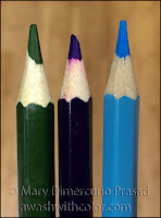
OOKU Watercolor Pencils - Sharpened Tips
The pencils came sort of sharpened... in a strange manner. Some had squared off tips, others were slightly broken. I had to sharpen some of them before use. I would have preferred that the pencils come unsharpened. The pencils come with a small sharpener but I only used it to sharpen one pencil to see how it worked. I used my automatic sharpener on the rest.

The sharpener that came with it did an OK job. The tip came to a point but was not completely smooth. I tried another pencil with my favorite small/travel KUM sharpener and it sharpened perfectly. (There are many types of KUM sharpeners; my favorite long point sharpener is a bit bulky for travel.)

The paint on the casing of the OOKU pencils do a fair job of indicating the color inside. Probably the biggest thing that annoys me is that there are no color names or numbers on the pencils. I ended up numbering the pencils with a black Sharpie (on the very dark colors, I used a white paint pen). The Prismacolor pencils have both names and numbers but the casings are not colored - this is my biggest annoyance with these pencils since it makes it more difficult to find a pencil you are looking for at a glance.

OOKU Watercolor Pencil Swatch Chart

I made swatch sheets for both sets of pencils (I do this for all my media). I used the numbers I wrote on the OOKU for identification. For the white pencils, I added a bit of black cardstock on which to swatch, to show opacity/vibrance. I used a waterbrush on the bottom half of the swatches. Most colors stayed fairly true to color, although some changed slightly (e.g. number 15 looked more yellow). They did look a little more vibrant as the color became thinner - showing more of the white below - and filled in the tooth of the paper. None of the colors separated (although the Prismacolor Mulberry looks like it did; I think some of the Ultramarine Blue dust got in it at the bottom - it didn't happen when I tried the color again on another sheet of the same paper). Note: I had used a different paper with the OOKU (watercolor paper), which is why the papers look different in the photos. I used a thick bristol paper with the Prismacolors, which is whiter than the watercolor paper.

I did not find the OOKU pencils to be "creamy" - they were slightly scratchy going on but the color lay-down was nicely pigmented. The cores are somewhat brittle - you have to use a light hand when coloring with a sharpened point or they will crumble and/or break. I had no trouble once I learned how much pressure they could take. They blended fairly well dry, but very well when mixed with a wet brush. The Prismacolor pencils are more waxy in feel - they blended well both ways. There was a little crumbling with a sharpened point on these as well (not so much as the OOKU though); I could use more pressure when coloring with the Prismacolors, which resulted in more color being laid down more quickly.

Prismacolor Water-Soluble Watercolor Pencils Swatch Chart

When I applied a wet brush to the tips of the pencils, I got much more pigment with the Prismacolor pencils, although the OOKU worked fine, they just took a bit more effort. In general, the Prismacolors were slightly more pigmented and quite a bit softer, making it easier to get color from them.

For each set, I applied the dry pencils to wet paper, carefully so as to not destroy the tooth of the paper. The OOKU went on somewhat lightly while the Prismacolors went on strong. Both pencils were difficult to blend out after this application.

Dipping the tips in water produced strong color from both, however they were also more difficult to blend with a brush after this. It took some scrubbing with the brush to dissolve them and the marks didn't go away completely, although this may vary with colors used. My guess is that the wet color dyes the paper somewhat, making it more difficult to move.

OOKU Watercolor Pencils Compared to Prismacolor Water-Soluble Pencils

Both pencils shined when colored evenly on dry paper and had water added with a brush. This could also be done by scribbling colors on some scrap paper and using it as a palette, picking up the colors with a wet brush. Overlapping colors allowed them to mixed beautifully. The pencil marks dissolved away easily in most cases (some colors were more stubborn than others).

The white OOKU pencil is the weakest pencil in the set, in my opinion. The Prismacolor definitely outshines the OOKU here.

My favorite pencils in the OOKU set are the silver and gold metallics. I have metallics in other watercolor sets (not the Prismacolor) but they don't work very well - using water on them makes the metallic look go away. These still had some shine even when used with water. I am so tempted to keep them (but I won't!).

Watch the following video to see the pencils in action and get a closer look at how the case rolls up.


Giveaway!

As a thank you to my subscribers, I am giving away this set of OOKU watercolor pencils, including brush, sharpener, and case. To enter, just "like" the video above and subscribe to my YouTube channel. Shipping to United States address only. I will be randomly drawing a winner from my subscribers! You have until Midnight on Tuesday, August 22, 2017. I plan to announce the winner the following day.

Follow my blog with Bloglovin so you won't miss any of the watercolor fun!

Tuesday, August 8, 2017

Travelling the World to See You Charm Accordion Card


My friend is returning to Chile, her original country, after living in the U.S. for many years. She was one of our first friends when we moved to NC over 22 years ago. I made this card for her as part of her going away gift. The map of Chile is subtly in the background behind the globe (cut from a sheet of patterned cardstock by Tim Holtz, from the Correspondence paper pad). We hope to visit her one day so we will definitely be "Travelling the World" to see her.

The stamp set "Travelling the World to See You" is by Dreamerland Crafts. It is a high quality polymer set of clear stamps in a slightly smaller size than their rubber stamps - perfect for smaller cards. The stamp set also comes with dies for some of the stamps. I could have used the dies for this card but since the area where I wanted to put the boy is much smaller than a standard card front, I decided to use masking. The card base was made with the Charm Accordion dies by Karen Burniston. The card is a "mini" size, measuring 3 1/4 x 4 1/4 inches. It's super cute!

To color the images, I used some inexpensive watercolor pencils I recently bought on Amazon during Prime day. The brand is Ooku; it includes 48 watercolor pencils, plus a sharpener, brush, and case. This is the first time using them. They worked better than I had expected. The biggest issue I have with them is that they are a bit crumbly - a light hand should be used when coloring. The set does contain a lot of useful colors so if you need a set of watercolor pencils and can't afford an artist quality set, these might be the perfect solution. I will be posting a mini-review of them coming up, plus giving away the set I used on this card! Be sure to subscribe to my YouTube channel for your chance to enter.

Affiliate links may be included in this post. See Notice at bottom of blog. I am a participant in the Amazon Services LLC Associates Program, an affiliate advertising program designed to provide a means for me to earn fees by linking to Amazon.com and affiliated sites. There is no cost to you.

Making the Card

1. Stamp monocular (hand held telescope) and boy from stamp set Travelling the World to See You (Dreamerland Crafts) on masking paper (or Post-it Tape) in waterproof black ink. Cut around each. Stamp the monocular on Bristol or watercolor paper so there will be enough room for the boy and the cloud. Mask the monocular. Using the boy stamp, line up the eyepiece with the boy's eye and stamp. Mask the boy. Stamp the cloud so it looks like the boy is sitting on it. Stamp globe in a separate area.

2. Watercolor the images (you don't need to color the globe base). I used Ooku watercolor pencils (see intro for information on them).

3. Once dry, cut around images - cutting the Earth away from the globe base. Using a black brush marker, from the back side go around edges to cover white. Lightly ink some edges of the images with Pumice Stone Distress Ink and an ink blending tool. Note: when I mounted the Earth on the card, the parts that stuck up were too white on the back so I used a gray Copic marker (N4) on the back, as well as on the edges of the dimensional tape; unfortunately, the marker went through the paper - something I should have thought of! I ended up adding more Distress Ink to help blend it. You do not need to add as much unless you like the look. Instead you may want to use a gray pencil to color the back (same in step 5).


4. Die cut card base and center charm holder/frame (Charm Accordion) from postcard/stripped double sided patterned cardstock (Correspondence, Tim Holtz Idea-ology). I used the bottom left corner of the postcard side of the paper for the card base. Keep the small frame inside piece of the charm holder for step 5. Die cut 6 copies of the corner decoration (swirls) from muted blue cardstock (matching the blue strips on the paper). I couldn't find one that matched perfectly so I used a very light pink/purple Copic marker on some blue/gray cardstock. It changed the color enough to match. Instead, you could match the red or beige stripes (and/or use Distress Ink to help with the color). Die cut 5 stars from gold glitter cardstock (I used Core'dinations Glitter Silk Cardstock). Cut the charm loops off of 4 of them. Optional: find the quarter sized map (Correspondence, Tim Holtz Idea-ology); use the base Charm Accordion die to cut out the desired section to decorate one of the panels. I cut it such that Chile would show on the left side under the globe. Trim off tabs and adhere to card base where shown (striped side, left panel). Die cut "jump ring" from light gray cardstock (I cut two copies and glued them together to make it thicker). Assemble card as shown in video below.


5. Color back sides of globe and boy where they will stick out using gray watercolor pencil or a gray colored pencil for this. Using dimensional tape, adhere to card as shown (be cognizant of how the card will operate, i.e. the globe must remain inside the window so it can swing without touching; the cloud will go under/towards the back on the right side in the open position). In black ink, stamp sentiment "Travelling the world to see you" on light gray cardstock (note: mine has a slight wood texture stamped in the background in VersaMark Ink - left over from another project; it is unnecessary but if you like the look you could stamp a subtle background pattern before stamping sentiment). Die cut using square decorator die (Charm Accordion). Use ink blending tool to add Pumice Stone Distress Ink to edges. Cut off diagonal corners from striped frame (saved from step 4) and glue on to adorn edges around sentiment. Adhere stars and corner decorations where shown (I used dimensional tape under the top left star for the front of the card). Adhere the sentiment using dimensional tape as shown, overlapping one glittered star.


Supplies


Follow my blog with Bloglovin so you won't miss any of the charming fun!