Affiliate links may be included in this post. I participate in the Amazon Services LLC Associates Program, Share a Sale, and other affiliate programs; these affiliate advertising programs provide a means for me to earn fees by linking to amazon.com and/or other affiliated sites at no cost to you. This helps offset a small portion of my crafting addiction... uh, hobby. I am truly thankful for your kind support! I also receive free products from my design team companies. Regardless, all opinions are my own. I do not get paid for my posts unless otherwise specified. Cookies may be used on this site. See notice at bottom of blog for a longer description.
Making the Card
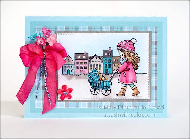
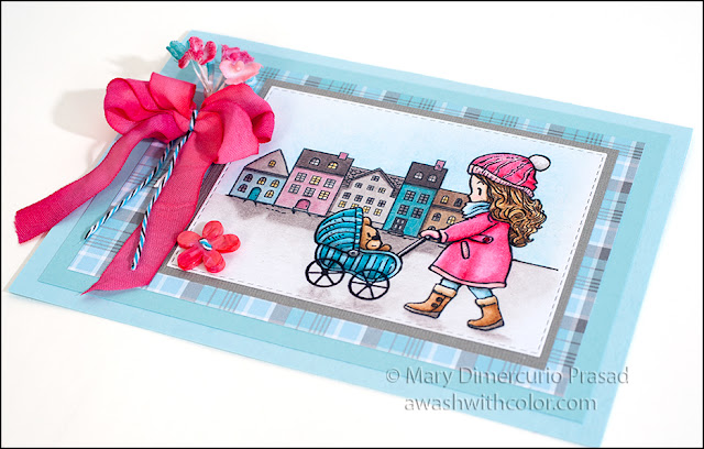
1. Cut light blue cardstock 7x10 inches; fold in half to form a 5x7 inch card base. Cut light turquoise cardstock 4 1/2 x 6 1/2 inches; adhere to card base. Cut plaid patterned paper 4x6 inches; adhere to card base in center of light turquoise.
2. Cut white cardstock about 4 1/4 x 5 1/2 inches. Watch video below; it compares walnut oil to Sansodor for blending. After the blending comparison I go into stamping and coloring the image.
Video Steps:
- Use a Stamp Platform or stamp positioner to stamp girl pushing bear in carriage with Memento Tuxedo Black ink on white cardstock approximately where shown (i.e. leave room on the left for the buildings).
- Stamp again on masking paper or frisket film (the clear masking shown in the video is no longer available). I used StazOn Jet Black ink for this since I would like to keep it for future use. Cut around mask. Place over image.
- Stamp houses where shown in Memento Tuxedo Black.
- Stamp boots on another piece of white cardstock in Memento Tuxedo Black.
- Color images with Prismacolor colored pencils; using Chelsea Classic Studio Walnut Oil and blending sumps, blend and soften colors. The colors I used are listed in Supplies.
- Cut around boots. Use black marker (Copic Multiliner Brush Tip) to go around the outsides from behind. Adhere over shoes in image. I used Lineco pH Neutral Adhesive in a Fineline 20 Gauge bottle for this.
4. Cut enough seam binding to make a bow with three loops and tails. Use Picked Raspberry and Festive Berries Distress Inks (plus optional Worn Lipstick Distress Oxide ink) to dye seam binding. I used a small mister bottle with water to wet the inks and seam binding as I went along the length of seam binding. Set aside to dry.
5. Use Distress Inks Picked Raspberry, Festive Berries, Peacock Feathers, and Tumbled Glass (plus optional Worn Lipstick Distress Oxide) to color bouquet flowers. I used cotton swabs to apply the colors.
6. Cut several inches of blue/white/black twine - this will be used to tie around ribbon. Wrap dyed seam binding around 2 or 3 fingers three times - leaving enough for tails. Pull off fingers carefully, grasp in middle. Tie twine around and secure with knot. Fluff loops.
7. Thread twine through hole in button. Trim and adhere on back with Glue Dot (you may also tie a knot but it might make it more difficult to adhere it flat on the card).
8. Adhere bouquet flowers, bow, and button using permanent Glue Dots, where shown.
Comparing Walnut Oil to Sansodor
In the video you can see me blending the colored pencil using walnut oil with blending stumps. Walnut oil is non-toxic and does not give off harmful fumes like other solvents. Sansodor, although as the name implies doesn't have much odor, gives off harmful fumes and must be used in a well ventilated area. It is a toxic substance, poisonous if swallowed (possibly fatal), harmful if inhaled, and harsh on the skin. Walnut oil is flammable (as many oils are) so care should be used when disposing of oil-soaked rags and other items, otherwise it is safe to use.
I would say that the blending is comparable between walnut oil and Sansodor. It is slightly easier with Sansodor but I definitely don't think using it is worth the added risks. When blending lightly colored layers, I actually preferred the walnut oil. See the chart below. The first (unlabeled) rows are straight pencil with no additional blending. The "W" rows were blended with walnut oil; the "S" rows were blended with Sansodor. I also wrote the Prismacolor pencil numbers I used next to each section.
The first rows on the left are simple gradient's of one color (208). Next to them on the right are light layers (pencils 208 and 925). The yellow to red and yellow to blue rows were colored pretty heavily. The walnut oil mostly took off the top layer of red over the heavy yellow, although Sansodor did something similar in the yellow to blue row. When colors were applied lightly (right side), they blended much more smoothly.
I will likely be trying linseed oil and lavender spike oil for blending
Supplies
- Dreamerland Crafts Stamps: Shopping Makes Me Happy (DCSD17025)
- Cardstock: White, Light Blue, Light Turquoise, Gray
- Patterned Paper: Lawn Fawn Perfectly Plaid Winter 6x6 (LF1253)
- Memento Tuxedo Black Ink
- Stamp Platform or Stamp Positioner
- Masking Paper or Frisket Film
- StazOn Jet Black Ink
- Prismacolor Pencils Used: 105, 925, 928, 941, 942, 946, 1040, 1051, 1052, 1054, 1056, 1082, 1086, 1093
- Chelsea Classic Studio Walnut Oil
- Blending Stumps (e.g. 7 of Size 1)
- Black Copic Multiliner with Brush Tip
- Die: Rubbernecker Stamps Small Stitched Rectangle Dies
- Distress Inks: Picked Raspberry, Festive Berries, Peacock Feathers, Tumbled Glass
- Distress Oxide Ink: Worn Lipstick
- Seam Binding: Hug Snug White
- Blue/Black/White Baker's Twine
- Tim Holtz/Idea-ology Bouquet
- Button: Red or Turquoise
- Small Mister Bottle
- Lineco pH Neutral Adhesive
- Fineline 20 Gauge Applicator & Bottle
- Glue Dots


Sweet blog! I found it while browsing on Yahoo News.
ReplyDeleteDo you have any tips on how to get listed in Yahoo
News? I've been trying for a while but I never seem to get there!
Appreciate it
Glad you like my blog! Thanks! I have no idea how it gets on Yahoo News - sorry!
Delete